Category Archives: Techniques and Processes 3

iAMquinn Test shoot 2

What have I done?

Below are 4 images I created of myself and Quinn to include in my Studio Practice project. I recently  created some images of me and Quinn, but I wasn’t happy with how the final images turned out, there was too much background and foreground in the image that wasn’t vital information to the subject.  So I decided to reshoot the images, using the same location but on a long focal length to blur out the background. I also took a tripod with me to use when shooting, because I wanted to shoot from stomach up, rather than including the floor in the image because it’s irrelevant information.

What have I gotten from this?

I think these images are a lot more successful than the original ones I took, they tell more of a story about mine and Quinn’s relationship, without looking too posed. Again, keeping in the theme of Quinn’s eyes avoiding the camera, but still smiling and looking happy. I wanted to include an image of mine and Quinn’s relationship to show how it has  grown and developed throughout the process of iAMquinn. I want to show our friendship as a positive thing in Quinn’s life, even though when she first came out as non-binary I was not very supportive, the image shows how I have developed alongside her and that I so support her, further more the image shows the impact iAMquinn has had on us both.


What’s next?

The next post will show the newest reshoot I did of Quinn’s eyes (the final image), I decided to photograph Quinn with her eyes open and her eyes closed, to start and end the project. I also thought this would be a good idea because it is out of the norm of photography to photograph someone with their eyes shut, as this is usually by mistake and avoided in portraiture. However I wanted to give the illusion of ‘a blink of an eye’, to show how all the images in iAMquinn, are all situations or memories in Quinn’s head, and the audience is walking through Quinn’s mind. Furthermore the final image of Quinn’s eyes finally meeting the audience/camera shows that she has finally grown the confidence to look people in the eye and has grown to accept people looking at her.


quinn and i test 2 image 4

Street Blur Shoot

What have I done?

The image below is one I took on my latest shoot with Quinn. The image represent’s Quinn’s fear of embarrassment. Over the past year I noticed a change in Quinn when we were out in public, she was a lot more aware and cautious of other people on busy streets. She often said to me that everyone was staring at her or cars driving past were looking at her, and I told her that she was paranoid and that not everything was about her. When initially speaking to Quinn about what kinds of images we could create for iAMquinn, she told me about her fear of embarrassment when being out in public, she was scared that either she would embarrass herself and draw attention to herself, or that someone would look at her and say negative things and reject the way she looks and dresses. I decided to interpret this image through people rushing past her, with Quinn sitting still, I did this because this is my vision of Quinn in a public place. Her anxiety gets the better of her and the chaos of a busy street is almost too much to take, she thinks people are looking at her. Again I had Quinn facing away from the camera to avoid eye contact, I tried to have her facing the camera and looking away, but the aesthetics of the image did not look correct.

What have I got from this?

Using Quinn’s friends as the people rushing past her, I used a slow shutter speed to blur the movement of her friends walking past, but a fast enough shutter speed to keep Quinn sharp. However the blur was not enough to get the effect I wanted, so I used post-production in Photoshop and used a motion blur to further the effect that I was looking for. I originally wanted to create the image in the centre of town, but Quinn was not comfortable with being photographed around so many strangers, so we decided to use the street we live on to help her feel comfortable. However, the pavement was not big enough for Quinn’s friends to fit past her, so we had to move into the road. I don’ think this takes away from the images message, if anything it confuses the audience more as to why Quinn is sat in the middle of a road.

What’s next?

Next I am doing a shoot with Quinn and her friends, I want to show the happier side of Quinn’s life. After a tutorial with Andy, we decided that the project was a little too dark, especially if this was someones only education on what it is like to be non-binary. I need to show that there are times in Quinn’s life and on the journey where she is happy and content, and I know that when she is with her friends who completely understand her and have accepted her, she is at her happiest.


quinn street blur.jpg

Final Evaluation of images

What have I done?

Below are the final images I am handing in for my  Specialist Techniques and Processes brief. The images are representations of different fears or anxieties that my sibling Quinn faces on a day to day basis.
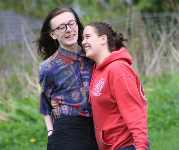


Image 1

This image will be the first in the body of work, I wanted to use a portrait at the beginning of the project to show Quinn as she is. But I wanted to create a portrait that still used a technique and that wasn’t just straight shot out of camera. I think a joiner was the best way to do this, because I interpret each piece of smaller image as a piece of Quinn that we are putting together throughout the project. Each image is a piece of her personality, fears, anxieties, identity and gender. I chose to keep the image in colour because the red in the image is so eye catching, but also the red on the lips on the wallpaper represent the feminine side of Quinn.


cropped-hockney-joiner-quinnonline-version.jpg


Image 2

This image portrays the pain Quinn feels expressing herself using make up. Although she feels like she should be able to wear make up like her female friends do, she is judged for doing so. A lot of people don’t understand Quinn’s situation and what they see when she wears make up is a boy wearing make up and that isn’t accepted. I wanted an image that showed the pain of this, but still included the make up in some way. I had trouble when picking this image, as I had two to chose between that were quite similar, and when I asked second and third year photography students, they all picked the image I liked less because they thought it was more powerful. However, I still printed both images because I was not sure which I wanted to include. When looking at the images at A1, I am so glad I printed both off because the other image looked too plain when printed so big, all it showed was Quinn’s face, it did not have the hurt body language that she displays in this image, nor did it have her outfit in it (which is important because she is wearing a skirt which is typically seen as a female item, it is also more personal for me as this is the first item of clothing I gave to Quinn after she told us she was non-binary).


makeup_8

Image 3

This image is probably the rawest and most powerful image I am submitting. After Quinn told us she was non-binary I noticed she had starting spending a very long time in the shower, so I asked her what she was doing and told me that the warmth she felt in the shower was something she was struggling to get through her relationships and friendships. I immediately wanted to portray this in an image, and it turned into a very hard-hitting image which interprets the shower as a place of solitude but also sadness. The tones in the image are very monotone but this works well because there is no distracting colours taking away from the expression on Quinn’s face or the fact that she is completely exposed.  Although I initially did not like the crop of the image (as her feet are cut off) a group tutorial showed me that a lot of people did not noticed nor did they seem to think it mattered as Quinn’s face and body were the main focus of the image.
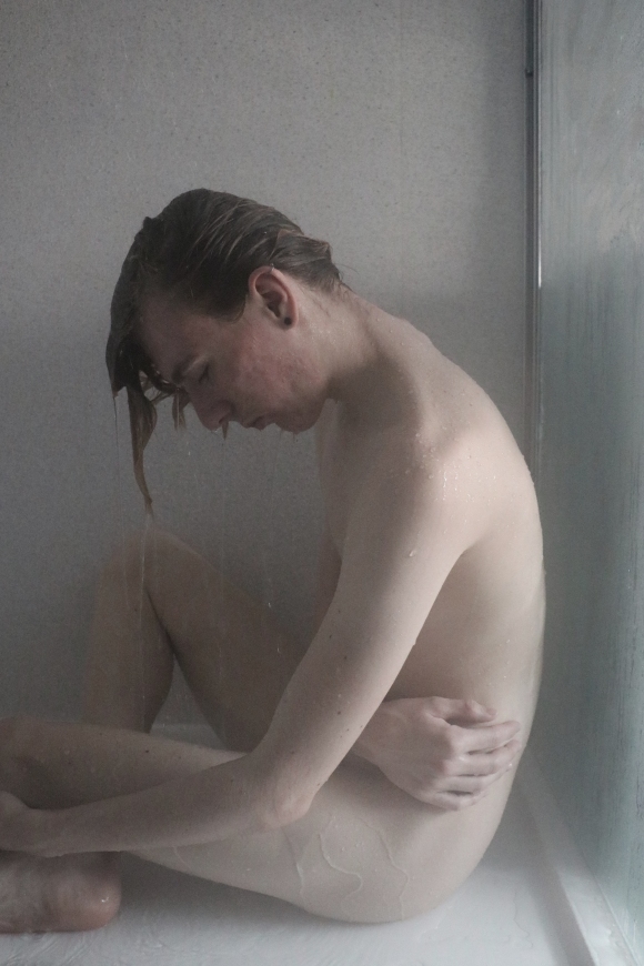
quinn 5


Image 4

In this image I decided to focus on the water droplets instead of Quinn, this was because I wanted to add some texture into the images, but I also wanted to make the image look quite dreamlike. Furthermore, the focus is obscuring Quinn’s identity to represent that she does not know who she wants to be, yet she is in what she feels like is a safe place. However, the viewer can still see Quinn’s sadden expression without any other context in the image. Again the image is quite monotone which I think works well. In each image there is either a big pop of colour or next to no colour at all, and this juxtaposition gels each image together, so even though each image style is completely different they still work together as a body of work.
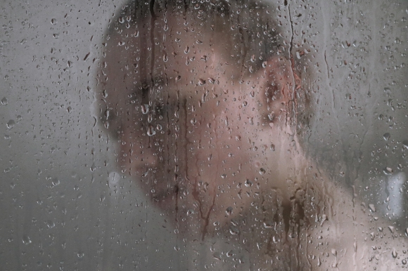
quinn 4

Image 5

This is the first image that I took for iAMquinn, the image represents the ‘cognitive overload’ that Quinn feels, as though her head is spiralling. I wanted to try and create the ‘falling’ effect I had seen many other photographers utilise in their images, to show Quinn spiralling. I also wanted to try and push my post-production skills, I think the image is quite successful, if I was to shoot it again I would include more background the give the image more depth and context. Although I think the images have all printed well, however, the darks and shadows in this image have printed slightly too dark and there is not much detail that can be seen in the digital copy.


quinn falling 2

Image 6

The final image I am submitting is portraying Quinn’s issues of panic attacks, she explained to me that when she has a panic attack it feels like she is drowning. I wanted to show this feeling quite literally, and so decided to shoot Quinn through the water. I also decided to create a triptych with the images, as on their own they did not have as much of an impact, but now they tell a story and almost look like Quinn is trying to breathe underwater. The image is quite hard to view because Quinn looks panicked, you can see the panic grow which is what I wanted to achieve, and shooting through the water gives the images a textured effect, again rather than just being straight shot.

I am quinn drowning 3 images

Work with Rowan Bowes

What Have I Done?

Below are 3 images that I collaborated on with MUA Rowan Bowes. Rowan came to me and asked if I would collaborate with her on 5 images, each image would be based on an old fashioned advert in which women are portrayed in a sexualised manner. We created 5 different images, but Rowan only needed to use 3 and below are the final images she chose.

What have I gotten from this?

This was an interesting collaboration as I have never had to shoot an image and take into consideration that there needs to be room for text over the image. Rowan then collaborated with a graphic designer who added the text and other images. I had a lot of different make up artists approach me who wanted to collaborate, but I chose to work with Rowan because I had worked with her before and I knew that she was a reliable, fast worker who I work really well with, we understand each other’s ways of working. A lot of the make up students I have worked with before have been running late and often are not very reliable, so I didn’t want to waste my time waiting around for someone running 2 hours late.  I wanted to take on this project because it also tackles the issue of gender and so it relates to my iAMquinn project as it questions gender stereotypes. It was also interesting to create because I didn’t make the end product, so I sent the images to Rowan with my edits to the models, and she then sent the images to her graphic designer and I didn’t get to see the final images till a couple of weeks later. We also worked really quickly together, usually a make up artist will come into the studio with no idea how they want the model posed or what kind of shots they would like, with Rowan she knew exactly what she wanted and so we got each shot in around five minutes. This was a really strange thing for me as I am used to spending a minimum of half an hour in the studio with a model.

What’s next?

Next I hope to work with Rowan again as we worked really well together and really quickly together. I also really like the make up she creates, she uses different make up than others and goes for quite an editorial look.


Printing, presenting and size

What have I done?

After seeing Ian Beesley’s exhibition at Salts Mill, I decided that I wanted to print my images bigger than I had ever printed them. I was originally looking at A2 (16.5×23.4″) because I knew that printing any bigger would cost me a lot of money, and I wanted to save my money to print my end of year show images as big as I like (although preferably I would like to print at A1). I looked around at different printers at costs and papers, such as The Print Space (TPS)

Screen Shot 2017-12-12 at 10.56.46

To print at A2 at TPS would cost me £19.70 per image on Fuji Crystal Archive paper (Matte or Gloss), I would prefer to print on matte as I don’t like the shine gloss paper gives as I think it reflects too much and takes away from the images. For my end of year show, to spend around £20 per image is quite a good price, however I would really like to be able to print the images at A1. To print at A1 at TPS would cost me around £40 per image, at the moment I cannot justify spending this much money on images that are test prints, but I still want to be able to print at A1 to see what the images will look like so big. I also really like the quality and the look of the Kodak Metallic paper which at A1 is £47.24 from TPS, I am not sure if the paper would suit the style of my images for iAMquinn but I would like to sample the paper at a smaller size. TPS also charge around £5 for delivery which is another added expense, with no other option to collect the images yourself. However, they do offer free delivery on orders over a certain amount and also offer a student discount.

Another printers I have been researching into is Proam Imaging. Proam offers A2 poster prints on Gloss Satin Paper for £6.04 and A1 for £13.13

Screen Shot 2017-12-12 at 11.17.54

Screen Shot 2017-12-12 at 11.18.07Screen Shot 2017-12-12 at 11.18.14


These are quite reasonable prices especially for test prints at that size, however they don’t offer a matte option on such big sized prints.

The final printers I looked into is a local business near me in Atherton called Murbros Printers, I was hired by the company a few months ago to take images of their new offices and I was told if ever needed images printing I should go to them. I was originally quoted £7 for a glossy A1 print, then the owner told me that he cold do them at £5 per print for me. I chose to go with Murbros because I had never had images printed from their and I wanted to see what the quality of the images would look like, for further reference, truthfully the price did sway me slightly but I also wanted to use a local business rather than a big company like TPS. I am happy with the prints I got back, although there is one print that is slightly too dark and doesn’t show the detail in the shadows that can be seen on a screen. I don’t think I would use Murbros for my final images in my end of year show, but because I wanted to hand in each image at A1 for T&P I decided to go with the cheaper option and I am pleasantly surprised by the quality of the prints.

Composite

What have I done?

Below is my attempt at a composite. We photographed the class separately in the studio and asked everyone to strike a different pose. Our aim was to use the pen tool to cut out each individual and then join them together in one image. When composing the image I had to take people’s heights into consideration, who would be stood behind another person and how each pose would balance out the image. I have some pen tool experience from my Union Jack Job which I collaborated with Kerrie Holmes, and we had to cut out 58 items of clothes that we had photographed in the studio (front and back) using the pen tool (see previous post).

What Have I gotten from this?

Although I have a bit of experience with cutting out clothing, using the pen tool on people was a lot more difficult. The clothing had a lot of straight lines and hard edges, whereas people are all different shapes and I found myself spending a lot of time going round every lump and bump of their clothing. This was because, as I discovered, cutting straight lines down people is a lot more noticeable than it is on clothing. I also struggled to cut round hair, so as you can see in the image, everyone’s hair looks as though it is stuck to their heads, this is because I could not cut round the fine hairs without keeping the background in the image. I spent a lot of time with graphic designer Candice Massaria, who helped me to find different ways to cut round hair in Photoshop, each way worked to a certain extent but was not a fool proof way of cutting round hair, but it worked a lot better than not including the hair at all. Andy suggested a software called Topaz Remask, which is specifically used to cut out hair and more difficult parts of an image, however the software is around £65 to buy and unfortunately I cannot afford that kind of money at this moment in time.

What’s next?

Next I am aiming to create another composite, using a different mix of poses and swap around the class to create a different composition. I will also be using some of the different techniques Candice taught me to attempt to cut around the persons hair more accurately.  However experimenting with using the pen tool on people as well as clothing is gaining me key transferable skills for my practice in the further as this is a key skill that many studios and companies look for. For example:

Avedon CK Nixon.jpg

My attempt at a composite:


composite 1.jpg


Black and White vs Colour

What have I done?

Below are all my final images from the various tests that I have done, and I have changed them all to black and white.  I did this so I am able to compare the images in colour vs black and white, and I think that using black and white completely takes away the emotion from these images. I think the images are a lot more successful, hard hitting and raw in colour, getting rid of all the colour in each image deprives the each image of it’s context, and therefor it’s effect on an audience. Ridding the images of their colour, I believe, defeats the idea behind the project. There is no emotion in the images when they are black and white, the warm yellow tones of images 2,3 and 4 are ruined by the black and white; the juxtaposition of the warm tones and Quinn’s ruined make up is not as strong as in the coloured images and the message is gone.

Image 9 (the Hockney Joiner) relies on it’s bursts of red throughout the image, the red is a constant throughout the different pictures creating the bigger image, and changing the image to black and white ruins the uniform of the overall look. Colour often symbolizes different emotions, for example red is often seen as the colour that symbolizes danger or love. So I believe in this particular project with this particular set of images, the colour and subject matter go hand in hand to create the overall effect that the images give. The red of the lips on the wallpaper is also a significant of what we perceive as feminine and that is ‘painted lips’ or lipstick, which we link with being female. So to change the image to black and white rids the image of it’s symbolism of femininity.

What have I got from this?

When thinking about whether I would have these images in black and white or not, and after reading Fat Rabbit creative‘s outlook on coloured images, I realised that colour is different from each person’s perspective based on their personal experiences. For example, to some people, blue is a very cold colour and to some blue is almost serene as they think of the ocean or being on holiday and being happy. In relation to this project and to Quinn, blue is often the colour used to represent masculinity e.g. baby boy blue, and so it is quite an emotive colour in terms of gender and stereotypes. Pink is often used to represent girls and femininity, and yellow is commonly used as a neutral colour for babies, and so the yellow glow of the sunset in images 2 and 3 could represent the neutrality of Quinn, and to drain the image of it’s colour, drains it off it’s voice and the things it represents.

Furthermore, in a lot of the images I have created so far, particularly the shower and bath images, the colour scheme in the images is very monotone. yet, I believe that this symbolises the lack of colour in Quinn’s life when she feels down which is what the images represent, when she is in the shower grabbing for the warmth of the water she is at a low point in her life, and the lack of colour in the image represents this. So to change the image to black and white (although it is not a big change in terms of colour) is a big change in terms of what the image is symbolising.


Techniques and Processes iAMquinn proposal draft 2

Project Title: iAMquinn


Introduction


iAMquinn is a photographic project that is going to explore the issues and anxieties that 17 year old transgender and non-binary teenager Quinn Rowbottom faces on a day to day basis. As a young transgender, non-binary person, Quinn has a lot of issues surrounding her in everyday situations and this project is going to visually explore some of those issues. However, iAMquinn is also going to include issues that all teenagers in Generation Y (also known as Millennials) are going through, and will portray the worries and stresses of being a young adult in modern society. Many of these young people are experiencing an identity crisis, with the pressure to keep up with current trends growing stronger than ever, they often lose themselves along the way. Growing up in a household with a millennial, I have witnessed first-hand the effect our technology filled world has on a young mind. British millennials have the second worst mental health well-being in the world, and are expected to go on to higher education, to be arty but study hard and get high grades, to have a social life but to stay healthy and exercise and to get enough sleep that they can get through the day without crashing. These different stresses can lead to a question of identity in young minds and this project looks to explore and visually depict these stresses.

Moreover, I want to explore the effect this world has on millennials and their gender identity. 1 in 120 people in the UK identify as gender non-binary (over 224,000 people). These people are not protected by the law and often feel marginalised by the media, the government and by society itself. This project is also a way for myself to understand what Quinn goes through seemingly on her own, as she is my sibling. For the past year my family has been struggling to understand the term non-binary and what it means for Quinn, the news came as a shock to us and we were uneducated as to what the term actually meant. I want this project to be able to open up communication between the non-binary community and those who misunderstand them.

Production Methods

The body of work will consist of around 8-12 images that all represent a fear, worry or issue that millennials face on a daily basis. I want an audience to look at the images and be able to relate to it in some way, however they decide to interpret each image. In this project, I want to experiment with reflections, water, Hockney Joiners and I also want to add more advanced post production within my images to create a more dreamlike effect. A Hockney Joiner will coincide well with the topic of identity and gender, as each photograph that creates the big image will symbolise a piece of Quinn’s identity/personality. I also want to experiment with underwater photography using a GoPro. Most of the images will be of Quinn and she will be my model throughout the project, however there will also be some images that do not include Quinn, and that will include objects from Quinn’s life. The final images will be printed at A1, and in my final show I would like to present them hung from the ceiling set out so that a viewer will have to walk through them and travel on the journey through the images with Quinn. I also want the first image to be a portrait of Quinn that the audience will view and then walk behind, this will symbolise them going behind the face of the project (Quinn) and going into her mind to understand the fears and issues. The project will be a collaboration between myself and Quinn to produce images that symbolise her fears/ issues and anxieties.


Research Requirements

For this project I am going to be researching into photographers such as Edward Honaker, a photographer who showed his own experience with mental health through his photography, creating haunting dream-like black and white images. Honaker’s images are a really big inspiration to me for this project, and his use of post-production and tricks in his images to get ‘the look’  is one of the reasons I want to experiment with more advanced post-production in my images. I am also going to be researching into Swedish photographer Arvida Bystrom and her take on gender in photography and her ‘femme’ images. In addition to this, I will also be looking into current trends in photography, and more specifically more current trends in gender and how is represented. At the minute, strong women and gritty women is a trend that seems to be taking over the world, and the photography world especially. Furthermore, having no gender is becoming more and more accepted and is being covered a lot more in the media by magazines such as Dazed.


Audience

This project would be presented in a gallery set out, so that a viewer/audience will have to walk through the images as though they were walking on a journey with Quinn. However for the end of year show I only have about 8ft of wall/space, so the images will have to be quite close together, yet I would like to print at A1 so that the audience can see all the detail in the images but they can also see the thought process that goes into each image. I would like my initial audience to be younger people who are part of the millennial generation, who can relate to the images even if it’s in their own context. However I would also like the images to reach a wider audience, those who do not understand the stresses that generation Y are under, this audience would more likely be the parents and grandparents of the Millennials, or simply those who do not understand the transgender world.


Mirror shoot

What have I done?

Below are two images from a test shoot I did with Quinn experimenting with hiding her eyes, this is because in every image I have taken so far, Quinn’s eyes have been avoiding the camera. This gave me the idea of doing a shoot solely focusing on avoiding/ hiding Quinn’s eyes. The images are semi successful but not enough to use as final images, but I think the idea behind the image could work really well with the rest of the images I have already. I have to find different ways of hiding her eyes, whether I do it digitally or using an object on the shoot, I need to experiment a bit more with this.

What have I gotten from this?

This shoot has helped me develop the idea a bit more and has given me some different ideas of how to hide her eyes. The message behind this image will be powerful because people say that the eyes are the windows to the soul, and to hide the eyes is to hide her identity and to hide who she is. I need to spend some more time on this shoot to experiment with different ways, as I only got two semi good images from this shoot, once we do an official shoot there will be a lot more images to chose from.

What’s next?

Next I need to come up with some ideas on how to hide Quinn’s eyes, I would like to do this in a range of locations and I would also like to use digital ways of hiding her eyes.


Room Shoot

What have I done?

Below are some images from a test shoot I did of Quinn’s room. When I first started the project, I only imagined the images being of Quinn, but after a group tutorial I decided to photography things that are related to Quinn, and her room is very important to her, it’s where she spends most of her time. So I went into Quinn’s room and started to photograph the items she had lying round, a lot of the things in her room are stickers or LGBT related things. Obviously this community is an important part of her life, so I wanted to try and involve/show this through the images.

What Have I gotten From This?

I do not think the images fit into my body of work, they do show what I set out to achieve, yet because my other images and quite fine art and dream-like, these documentary type images do not fit well with the others. The first image is quite a hard hitting image, this love heart has a word that has the stigma of being a bad word. ‘Queer’ is known to most as an insult and a word that is tainted with hate, so to take this word and change the meaning of it is quite a powerful thing, and to put it on the background of the pride flag colours almost gives the impression of acceptance. I think the image itself does not do justice for the powerfulness of the sticker, but I was not sure how I should shoot it to get the meaningfulness of the word. Another image I think works well (although not as part of this body of work) is the 3rd image, the ‘Trans is not a choice’ sticker also has a very powerful message and adds context along with the first and 4th images. The words on the sticker are important and obviously has memories, enough for Quinn to put the sticker up next to the mirror she looks in every morning to remind herself that there is not anything wrong with her and the way she feels.

The second image, although not executed right actually has a very sad and touching meaning behind it. The image is of a Lloyds Pharmacy bag, which contains the depressants Quinn takes everyday. The bag is also addressed to ‘Master Ben Rowbottom’ as this is still Quinn’s legal name because she is 17 and cannot legally change her name without my mum and dads help, and I do not think my mum can bring herself to change Quinn’s name so soon. So all the post Quinn gets is addressed to a name she no longer associates herself with, it is hard to imagine how that feels without going through it ourselves.

What’s next?

Next I am going to experiment with different mirrors and see what angles we can photograph through mirrors. I want to experiment with hiding Quinn’s eyes, as in all the other images she is not looking at the camera, so I would like to continue with this theme and experiment with different ways to have her eyes avoiding the camera.